"Musing" is a design summer project about the diary of 40 years old woman.
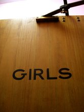
love the look.type not easily readable stacked, but maybe that's what you intended.just keep working.you're loosening up.good.nice to get out of "pleasing the client" mode.right?once you have established your graphic style, you can go back in without being easily thrown off base.g.
This is a lovely piece. I agree with Gen that it is hard to read the type.Makes me dizzy.
yeah it was intended. I should write it in Chinese. It would be easier.
that's a great idea!
Enregistrer un commentaire


4 commentaires:
love the look.
type not easily readable stacked, but maybe that's what you intended.
just keep working.
you're loosening up.
good.
nice to get out of "pleasing the client" mode.
right?
once you have established your graphic style, you can go back in without being easily thrown off base.
g.
This is a lovely piece. I agree with Gen that it is hard to read the type.
Makes me dizzy.
yeah it was intended. I should write it in Chinese. It would be easier.
that's a great idea!
Enregistrer un commentaire